Understanding The Difference Between Cross Browser Testing & Responsive Testing
Table of contents
- What Is Responsive Testing?
- Why Is Responsive Testing Important?
- What Is Cross Browser Testing?
- Why Is Cross Browser Testing Important?
- The Common Goal Of Cross Browser Testing & Responsive Testing
- Achieving The Common Goal With LambdaTest
- Performing Cross Browser Testing With LambdaTest
- Performing Responsive Testing With LambdaTest
- Increasing Importance
The ubiquity of the internet today is undeniable. It is thus incumbent upon website developers to make sure that web user’s online experience is easy, convenient, hassle-free, and even enjoyable, if possible. This requires a well-organized release cycle where developers and testers do their best to deliver a robust and competitive product to the market. However, we often forget or get confused between the literal meaning of Responsive testing and Cross Browser Testing. This underscores the importance of cross browser testing and responsive testing. Both are crucial in website development but are quite distinct from each other. Both also happen to be offered by LambdaTest and we will be looking at each of them in this article after understanding the basic difference between the two types of testing.
Cross browser testing deals with functionality and interoperability, while responsive web testing focuses on aesthetics and adaptability. The former is thus concerned with what browser web users are using; the latter, on the other hand, is focused on what devices web users are using. Still confused? Don’t worry! I will be talking about them in detail. By the end of this article, I will help you evade the ambiguity between Cross browser testing and Responsive testing.
What Is Responsive Testing?
The generation we live in, demands for convenience. Gone are the days when PC or Laptop were the only ways of accessing a website. Advancement in technology of mobile phones, tabs, and high-speed internet has significantly impacted the user’s preference for accessing the web. Responsive testing is a process that ensures the rendering of web pages across viewports of multiple devices. Its end-goal is to make sure that web pages look good & provide relevant information to the website visitors on every device.
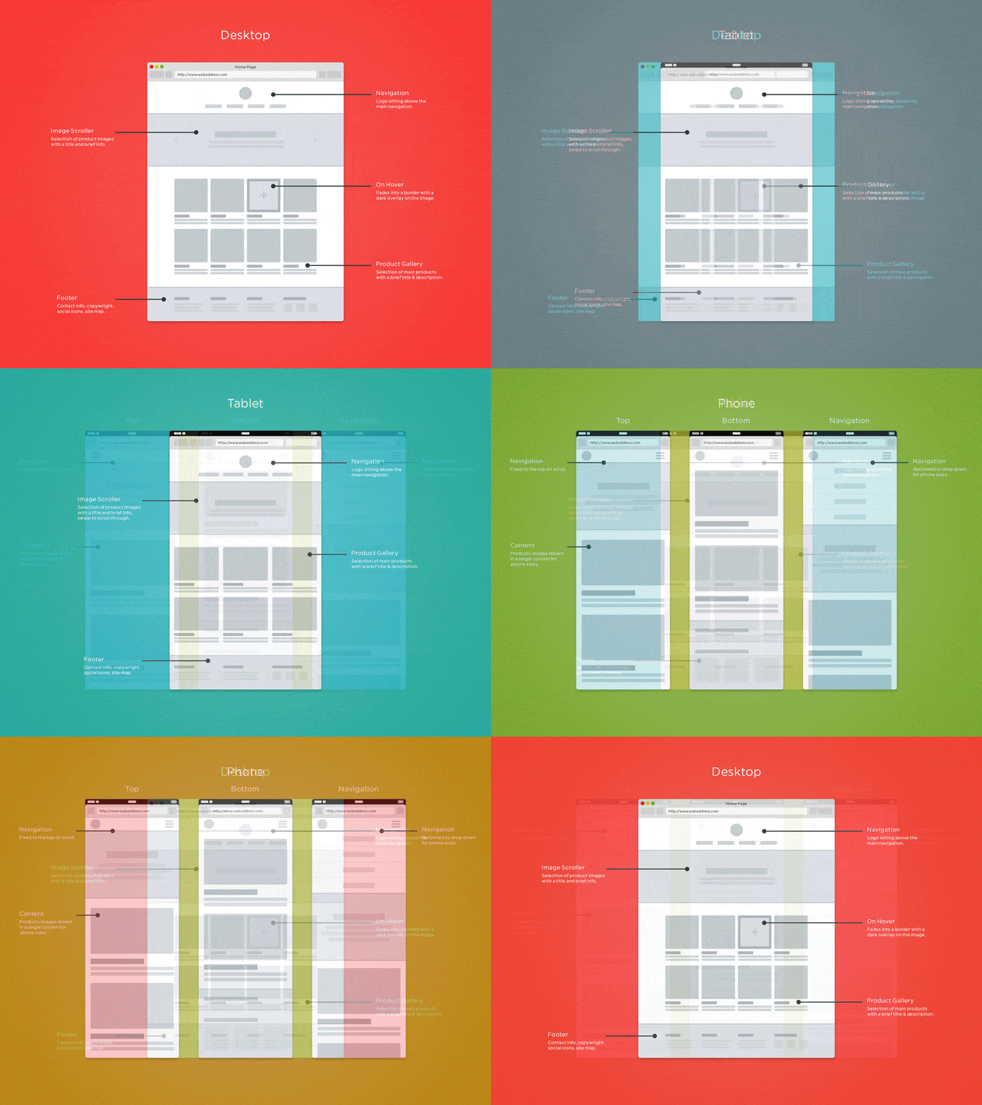
With this Responsive testing tutorial for beginners, you will learn how to perform Responsive Testing of your website on the LambdaTest platform.
Check this out: System Testing Tutorial- A Comprehensive Guide With Examples and Best Practices
Why Is Responsive Testing Important?
Imagine the number of devices your customers may be using. Screen size for mobile will be far different than that of desktop devices. Also, not all mobile will offer the same viewport or screen resolution. Now, are you going to come up with a dedicated web page for each device view? Imagine how many devices that would be. For that purpose, organizations prefer to opt for Responsive Web Design(RWD). The idea behind RWD is to save the time and effort required to create dedicated web pages for different screen sizes. So, you develop a single website or web-app with RWD to help it render seamlessly across different devices. Post development, comes testing. The testing procedure for validating the RWD works as intended is what we term as Responsive Testing.
Similar to Cross browser testing, Responsive testing is critical for offering your customers a good UI & UX. If a site is unresponsive then the content of the web page stays static irrespective of the screen resolution used to view the website. So you miss out on relaying the relevant information to your customers.
Now, let us have a look at a non-responsive website.

Unresponsive Website
Did you notice the hindrance from the end-user point of view? Now, let us evaluate a responsive website. I will be demonstrating LambdaTest.
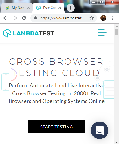
Responsive Website
Did you notice that the only scroll bar here is for vertical-scrolling unlike the unresponsive website where we had a scroll bar for horizontal-scrolling as well? That is not all. The content is auto adjusted and you can view the whole website in a neat and presentable manner, along with a hamburger menu on top to help you navigate through different tabs of a web product. Visit LambdaTest homepage to understand how the content of web-page has been adjusted into a mobile screen resolution.
Our article on ‘9 Mistakes to Avoid While Optimizing Your Site for Mobile Devices’ explains that optimizing a website to be mobile-friendly is important as it ensures proper rendering across a range of devices. There is no need to create a mobile version of the same website. Consequently, costs are reduced and it won’t take as many man-hours to complete.
Perform Responsive Testing On 50+ Mobile Views With LT Browser
In this detailed walkthrough of LT Browser tutorial video, we will help you get started with LT Browser.
Check this out: Manual Testing Tutorial- A Comprehensive Guide, with Examples & Best Practices
What Is Cross Browser Testing?
Cross browser testing is a process of testing a website or web-app across numerous browsers, browser versions running on different operating systems to ensure rendering of the website stays as intended.
The primary reason of performing cross browser testing lies with the differences between rendering engines of different browsers. Every browser possesses a distinctive rendering engine for summoning your web elements when someone types your website’s URL in the address bar. Basically, rendering engine of Google Chrome will interpret the code of your website differently than rendering engine of Mozilla Firefox, Safari, Opera etc. Also, every browser version will have a unique rendering engine too. So, Chrome 68 may differ in rendering a website than Chrome 69, Chrome 67, etc.

Why Is Cross Browser Testing Important?
Imagine all the hard work you put in for developing a top-notch website using Google Chrome, only to watch it fail miserably on Safari, IE, any other desktop browser, or mobile browser.
If you go live with your web-app without incorporating web based browser testing in your SDLC then you are at a potential risk of offering a troublesome user-experience to your website visitors. Not only are you failing to attract a new customer for your web product, but you are also letting down your existing users to quit on your web product. It’s simple, If you won’t offer them a good, consistent user experience then somebody else will.
UX is not the only reason, you also have to keep in mind the UI(User Interface) of your web product. Cross browser testing will ensure better accessibility and readability to your users. For instance, say you are creating an HTML form, you are declaring different form input types, one such HTML input type is of Range for the purpose of specifying the annual income, bulk order etc. Range input type in HTML is pivotal for every website or web-app. However, it is not rendered in a consistent manner across different browsers.

Range input type In IE11

Range input type in Google Chrome 72
Check out are article on: Are Your HTML5 Input Fields Cross Browser Compatible?
Given these points, it can be said that a website’s lack of browser compatibility is detrimental; rather than switch browsers, web users are likely to look for a different website.
Now, that we realize how imperative Cross browser testing is for a website! The questions arise on the approach to perform cross browser testing
Well, there are 2 approaches to perform cross browser testing.
Manual Cross Browser Testing
Automated Cross Browser Testing
Both of the approaches have significance in their own ways. Manual cross browser testing is important for test verification. Automated cross browser testing is important for test validation point of view.
Automated cross browser testing will help to load off the repetitive test cases and speed up your test cycles. Manual cross browser testing will help to provide better test scenarios for generating your automation test scripts.
CHECK HOW YOUR WEBSITE LOOKS ACROSS 3000+ BROWSERS AND OS : FREE SIGNUP
The Common Goal Of Cross Browser Testing & Responsive Testing
By far, I am sure we are well versed with the difference between the two terms i.e. Cross browser testing & Responsive testing. Well, can you think of the common goal for performing these two different types of testing?

Time’s up!! Common goal would be to provide a flawless user journey to your customers. Another key thing to highlight here is that responsive testing happens to be a subset of Cross browser testing.
Achieving The Common Goal With LambdaTest
LambdaTest is a cross browser testing cloud which offering more than 3000+ real browsers and browser versions running on different OS to help you deliver a consistent website or web page to your users. With LambdaTest, you can do both, Cross browser testing as well as Responsive testing / mobile website test.
Performing Cross Browser Testing With LambdaTest
LambdaTest offers an intuitive UI for performing both manual, and automated cross browser testing with Selenium Grid.
Manual Cross Browser Testing — LambdaTest offers a feature called “Real Time Testing” that allows you to perform live-interactive testing with your web-app by providing a VM(Virtual Machine) based on your selected OS + browser configuration.
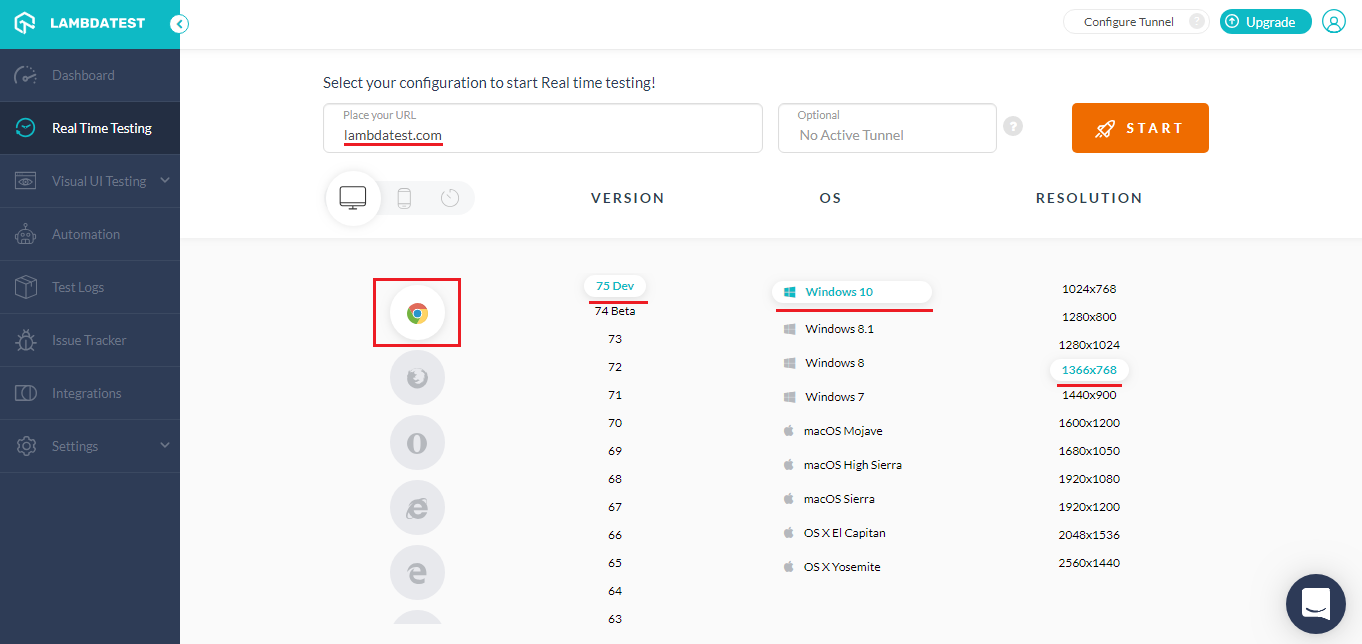
However, performing live-interactive testing will definitely be time-consuming. What if you want to have a quick look of your website to validate browser compatibility testing?
LambdaTest offers Screenshot testing to help you capture screenshots in bulk for your website over different desktop and mobile browsers. Select up to 25 configuration of your desired browser + OS configuration in a single test session. You can switch to mobile view of website using the toggle next to Desktop icon. Simply, place the URL you wish to test, select your configurations and hit the Capture button.
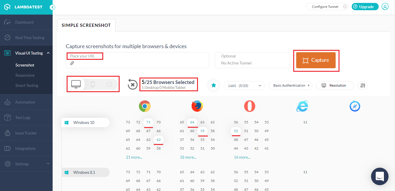
Screenshot testing offers a lot of cool features. Check out the 10 must try features of Screenshot Testing on LambdaTest.
Automated Cross Browser Testing — As explained in earlier section, automated cross browser testing is relevant to pace the test cycles by automating the repetitive test cases. LambdaTest offers a cloud-based Selenium Grid to help you execute your automation test scripts on more than 3000 real browsers and browser versions.
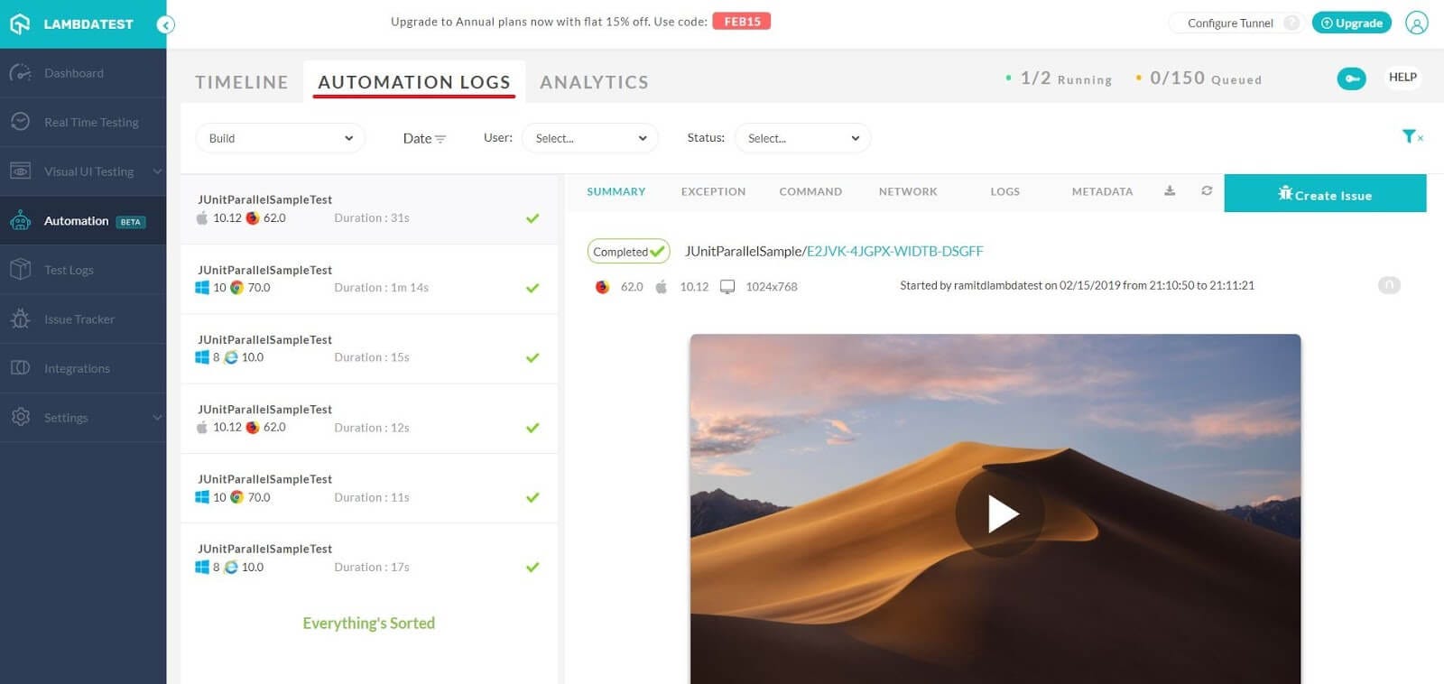
Selenium Grid offered by LambdaTest provides compatibility with every test automation framework that supports Selenium.
LambdaTest also offer integrations with multiple CI/CD tools to help you speed up your go-to-market launch.

You can also perform parallel testing to run multiple automation tests simultaneously.
You can find all the logs of your test execution such as network logs, command logs, Selenium logs, command-by-command screenshots, video recording and more.
When you execute automated cross browser testing then reporting becomes vital to keep a track of numerous test case execution. LambdaTest recently went live with restful API to help your extract your test results from LambdaTest in order to build powerful reports.
Still, it should be noted that despite the automation, observing the running script with pen and paper at the ready is a useful technique. This way, you can spot problems that even automated checks can’t. Creating a browser compatibility matrix is also a helpful technique, as it is a means to make sure that you cover all the possible browser and operating system versions along with all the devices.

This certification is for anyone who wants to stay ahead among professionals who are growing their career in Selenium automation testing.
Here’s a short glimpse of the Selenium 101 certification from LambdaTest:
Check this out: User Acceptance Testing (UAT) Tutorial- A Comprehensive Guide With Examples and Best Practices
Performing Responsive Testing With LambdaTest
Before I tell you about performing responsive testing with LambdaTest. I would like to inform you the oldest trick in the book to perform responsive testing. Open the website you wish to test on your local browser window and minimize your browser. Now, pick any corner of your browser window and drag it either horizontally, vertically, or diagonally. You will be able to notice whether your website is changing dynamically according to browser window’s size.
Main drawback here is that when you are testing responsiveness of your website through this approach then you are viewing everything from the perspective of your local browser’s rendering engine. In reality, your users may be using Safari, Opera, Yandex, Edge, IE, or any other browser. A different browser possessing a different rendering engine over a different device than yours can have a major difference in the look and feel, in comparison to your browser-window dragging approach. This is why you need to perform it over different devices through device labs, or emulators/simulators. Device labs could be very expensive and unaffordable to many small start ups, freelancers etc., so a good choice would be to go with a cloud-based service provider such as LambdaTest.
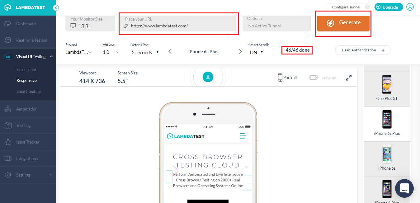
LambdaTest allows you to perform responsive testing on 46 mobile and desktop devices in a single go. Just provide the URL you wish to test and hit the Generate button. You can change the defer time for capturing screenshot, adjust the monitor size, can view a device in portrait or landscape mode according to your reference and do a lot more. Follow our documentation on Responsive testing to know it all. You can use LT Browser, a mobile friendly tester to build, test, and debug your responsive website.
Increasing Importance
With increasing updates in various browsers, many web elements are being deprecated, and many web elements that were previously unsupported among majority of browsers are now being cross browser compatible. Without a doubt, both cross browser testing and responsive testing are important, especially in today’s internet-dependent world. Keep in mind, that responsive testing is a subset of cross browser testing, and both are critical in delivering a pixel-perfect user journey to every visitor on your website. Happy Testing! 🙂

